Dr. Albert Mehrabian, author of Silent Messages, conducted studies regarding nonverbal communication. Mehrabian found that 93% of daily communication isn’t what you’re saying with words, but rather everything else. Similar to how we physically communicate with each other, typography communicates through design many of the same “unspoken” elements.
One of the most pertinent components of any sign is the design. Design allows for signage the capacity to communicate unwritten meaning. As a Communication major college student, this speaks volumes for me in regard to signage. Signs have a finite physical space for text, and therefore written message. In the Communication field of study, design falls under the glorious category of atmospherics, which is essentially one of the most established and persuasive marketing tools. The same year Elvis released “Aloha” and Paul McCartney sang “My Love,” Dr. Philip Kotler coined the equally momentous term and concept. Atmospherics relates the idea that in a person’s decision making process, they respond to the “total product” as opposed to the “tangible product.” Thus, it’s argued that the tangible product is in fact just a small portion of the package. Kotler goes as far to state, “In some cases, the place, more specifically the atmosphere of the place, is more influential than the product itself in the purchase decision.”
Clearly, design is important. In the decision making process, the world is progressively becoming more and more aware of the impact of visual design. People take into account the aesthetic, or the color, shape, feel, attitude, and overall design of the product or space. One fascinating facet of this are typefaces. Typeface is the technical term for what most of us call fonts.
- font: a set of type of one particular face and size.
- typeface: an individual family member of that font.
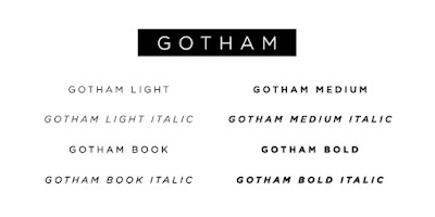
Remember in 9th grade Biology when you learned that your golden retriever isn’t just a dog, but rather it belongs to the species Lupus familiaris, the genus Canis, and the family Canidae? Think of it like that. We can use Gotham, for example.
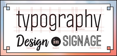
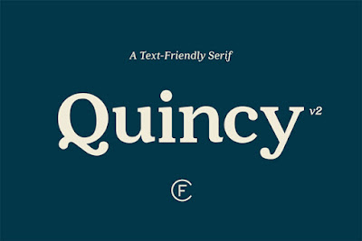
- Serif: Serif fonts are characterized by the little “feet,” or the slight projection at the end of a stroke on the bottom of letters.
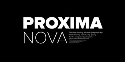
- Sans Serif: Sans Serif fonts don’t have “feet” or serifs.
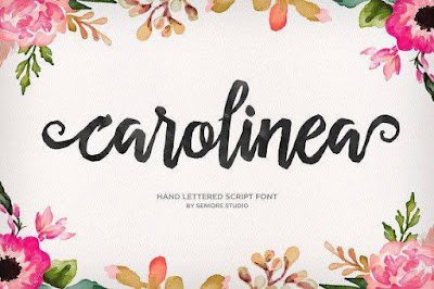
- Script: With light brush-like strokes, script fonts are increasingly popular. However, this type of font is not designed to be used as body copy for legibility purposes.
- Decorative: Display fonts can be seen on movie posters, newspapers, banners, and more of this sort. These fonts will grab your attention!
Poffenberger and Barrows conducted a study WAY back in 1933 to figure out how shapes and lines communicate nonverbals like emotions. Their hypothesis centered around our eyes moving along a shape as we look at it, which translates into a physical experience that reminds us of the body language used to express emotions. Participants matched emotions to the visual, and the pair found that lines going downwards make us feel “doleful,” while upwards lines make us feel “joyous.”
All of this plays into why fonts are so integral to branding. Before we even know the actual text of the sign, we mini detectives are deducing things like the age of the company, the services, and even whether or not we like the company. Much of this has to do with font trends, which reflect generational tendencies as well as our ever changing culture. A current, widespread trend is scripted fonts, which younger companies use to attract younger audiences and clientele.
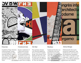
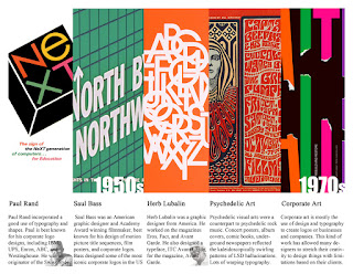
Follow the years with these graphics, created by Russell Gividen:

