As humans, we naturally approach change with a certain level of apprehension. From that ratty, old college sweatshirt you have in your closet, to the torn up leather couch in your living room, it’s hard to let go. Likewise, many businesses have a hard time parting with their current office design. In addition to the expenses associated with a workplace makeover, we also grow too comfortable—rather, too complacent—with the way our current office looks. The biggest reason for this: we fear change. Change is scary. However, in a business setting, change should be welcomed! Freshening up one’s workplace typically coincides with an updated brand, a new beginning, or some other happening that warrants excitement rather than incredulity or uncertainty.
New signage is just one component of workplace change. However, it often seems that new signage is one of the last considerations by purchasing departments. Perhaps, part of the reason that signage is often forgotten about when offices are being revamped or revitalized is that people simply don’t know when it is time for old signage to be taken down. Fear not, purchaser: here is a complete guide that will work to answer the age-old question “when is it time for new signage?”
Reason #1: When you are rebranding your company
Ah, the rebrand: a sign maker’s dream. A company’s marketing efforts trickle down to all levels of the organization, including the building itself. An updated brand, if done correctly, almost always incorporates the updating of interior and exterior signage. Here are a few examples of when a rebrand should also include a change of signage:
Updated color scheme. A company rebrand often encompasses a changing of colors. What that means is that the rust brown office door signage no longer fits for a company with a green logo. It is quite popular, nowadays, to synchronize one’s color scheme with their interior and exterior signage. So, everything from workstation name plates to door placards must go. Out with the old, in with the new.
- Text and font changes. Not only does a rebrand involve updating colors, but it also encompasses the modifying of the slogans, verbiage, and basic fonts that companies choose to use. New signs become a necessity when new text is implemented. It’s quite common for a business to boast its slogan, mission statement, or any other jargon within their company’s facility. These words of importance are plastered on a variety of signage around the office. When new words are chosen, new signage should be, too.
- Design. Design. Design. An updated brand beckons a company to continue its path to modernization; in comes modern signage! New signage can either be the first, or the last, step in a company’s rebrand. Regardless, it is seen as essential for companies to sharpen their image in time for a rebrand. As design is granted an increased amount of attention, that same devotion to design should be articulated in one’s signage. All signage, interior and exterior, must be modern.
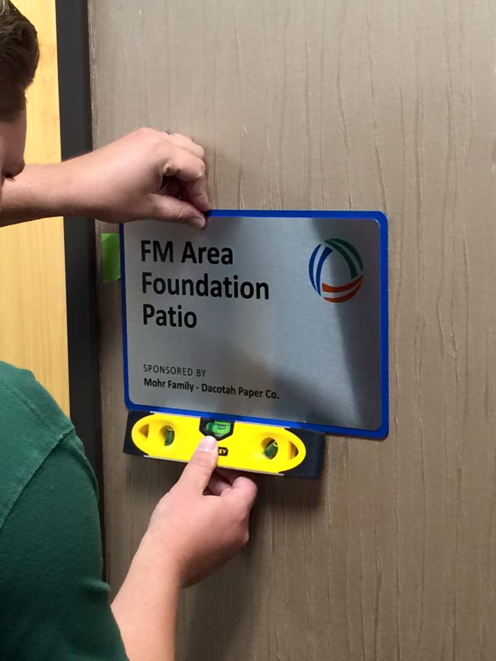
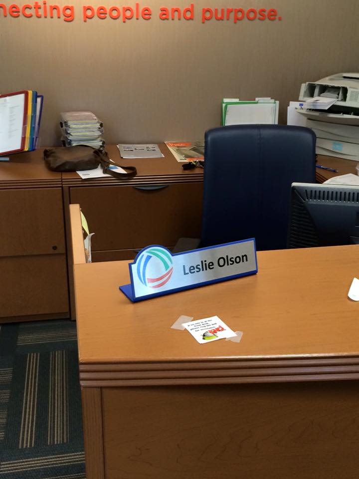
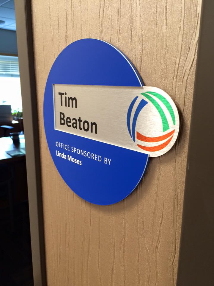
Shown below are some images of signs we made for the FM Area Foundation, a charitable organization that addresses community needs, while helping individuals fulfill their philanthropic goals. I met with the FM Area Foundation team at a time in which they were going through a rebrand. Their requests for updated interior signage were pretty simple: “we want something fun with a lot of color!” Matching the company’s font, color scheme, and desire for improved design, we came up with the following sign package. The results were awesome, and they were very impressed with our work! This goes to show how new signage can be the perfect addition to a company’s rebrand. When it’s time to rebrand, it’s also time for new signage.
Reason #2: When your current signs are an eyesore
Sometimes, honesty is the best policy. We encourage every customer out there to let the business they are visiting know when their signs are hideous and need changing. It may hurt the company’s self-esteem just a little bit, but it will also encourage them to consider updating their signage. Seldom talked about, signs are actually one of the very best marketing tools that a business can implement. Close your eyes for a second and think of the best sign you have ever seen. I can almost guarantee that it is for a business that you would never have noticed if not for that sign. Now, you love that sign! It’s a staple to your city: a welcome sight that implores you to learn more about the company who resides in the building. An ugly sign is a waste of a great marketing opportunity. How do you know your sign is old, ugly, or simply needs changing? Here are a few checkpoints for you:
- Cracking. No matter the material you use, your sign will likely not be life-proof. Though certain materials are more durable than others, cracking of any form is a telltale determinant that you need a new sign. Keep in mind; cracking and disfiguration are much more common with exterior signs. However, even custom office signs, copay signs, slider signs, etc. can fall victim to natural wear-and-tear. Keep an eye out for cracks in your signs.
- Peeling. Most common with window vinyl and other signage of the thinner variety, lookout for peeling! You do not want to risk one of your letters falling off, resulting in an embarrassing message (i.e., “Shmit’s Creek” losing its ‘m.’). Okay, that’s a stretch; but it should be every business owner’s goal to maintain pristine signage that beckons customers to visit their location. Keep an eye on your sign and make sure that no peeling is occurring. If any is, then it might just be time for some new signage.
- Fading and Discoloration. Once again, this is most common with exterior signs. However, fading and discoloration are major areas of concern when it comes to your signage. Be aware of the fact that most signs that receive a considerable amount of sunlight may also experience a slight change of color. Too severe of a color change will leave you in need of new signage. ASAP.
The first step in recognizing that your sign needs to be changed is admitting that it is unattractive. The second step is vowing to make a change! If you notice any forms of cracking, peeling, fading, or discoloration, it is probably time to make that change. Perhaps you would just like a new, more cunning and relevant graphic. Although I may be biased, aesthetically pleasing signage is of the utmost importance. Do not take this lightly!
Reason #3: When your building causes navigational issues
We sometimes get so caught up in the appearance side of signs that we forgot about their ultimate purpose: to help you get from point A to point B… and then to points C, D, and E, too. I could walk you through the benefits of wayfinding signage, and how navigation is made easier through the implementation of signs, but I’ve already done that before. Instead, I will simply make you aware of the fact that navigational issues within your building or store are a huge detriment to customer retention and overall peace within your place of work.
One of the best indications of how well your signs work for navigational purposes is the amount of questions you receive beginning with “where is…” Anyone who has worked in the lobby of their office, the guest service section at a retail store, or any other setting that is frequented by clients and customers will understand the woes of a confusing building layout. Signs are designed to assuage those issues and allow for easier navigation. If your signs are placed in large areas of traffic, and accurately guide your customers to the parts of the building they wish to be in, the entire customer experience is enhanced and expedited. This means that your employees can go back to focusing on tasks more important than being a travel guide, and your customers can leave with a smile on their face. Ultimately, your obligation as a store owner or office administrator is to help customers navigate through your facility with greater ease.
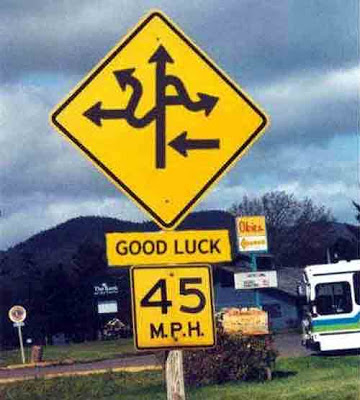
If your signs are causing more consternation than comfort, it’s time for a change. Don’t forget that your signage is meant to be a solution—a cure to the navigational issues that would otherwise be experienced with insufficient, or nonexistent visuals. As building layouts change, likewise, signs must be updated and/or changed to account for new rooms and modified locations. Do not delay this changing of signage! If you want your company to stay operating as a well-oiled machine, make sure that your navigational/wayfinding signs are up to the test.
Other Possible Reasons
Although the aforementioned reasons are some of the most common, they are by no means the only justifications for upgrading your office signage. Yes, it is common for companies to change out signage in coordination with their rebranding efforts. Yes, it is also necessary for companies to make a move for new signage if their current signage is becoming worn or if their customers are having navigational issues. Still, there are a plethora of other times in which a company should discuss the need for new signage. Some examples are as follows:
- You are moving into a new building.
- You have new employees that require new wall name plates and office door signs.
- Your current signs are receiving complaints.
- You have new promotional deals and offers that you would like to display.
- You just, frankly, want new signs.
Don’t be confined by your signs. I rhyme all the time. If you have a desire to update your location, improve your brand, tear down your old signs, expedite navigation through your building, or simply modify the sign package in your location, it is the right time to modify your signage. Have any questions for us? Reach out to us on Facebook, Twitter,Instagram, or Google+ and let us know how we can help!
If you’re interested in renovating your workplace with some brand new signage, check out our inventory and selection here!
Written by: Jack Yakowicz
Account Manager at Office Sign Company
Contact at jack@officesigncompany.com


