As the new year rolls around, many of us have developed resolutions for ourselves. In addition to cutting candy consumption out of my 2016, I resolved that I would work my hardest to provide my Office Sign Company blog readers with thought-provoking posts (that’s how much I care about you). Okay, I’ll stop kissing up. On a serious note, many businesses are using the new year as a time to roll out some fresh office signage. Perhaps it’s been a full decade since your office has been revitalized with new restroom and conference room signage; maybe, you are simply in the process of rebranding and need a signage update to stay in line with your marketing goals for the year. Whatever your reason for implementing new signage in 2016 is: you’re making the right choice.
Throwing away your old, rusted signage and mounting new interior office signs is one of the best new year’s resolutions your company can make. In an attempt to make sure all of my readers are equipped with the knowledge to stay modern with their sign design in 2016, this blog was constructed to list out a series of 10 trends or predictions that I have for the new year in the world of interior office signage. These top 10 trends are of vital importance when it comes to purchasing new signs this year. Let’s begin.
#10: Creative ADA Braille Design
Say goodbye to the days of white tactile lettering on black acrylic. In 2016, businesses are going to be increasingly creative with their braille signage. For those who don’t know, “ADA Braille Signage” is a term used to refer to signage that is compliant with rules established by the Americans with Disabilities Act (a law passed in 1990 that prohibits discrimination against people with disabilities in employment, public accommodation, etc.). Many public spaces, including offices, hospitals, retail centers, etc., are required to incorporate signage that fits within ADA regulations. Although ADA Braille signage has very specific guidelines regarding the layout of a sign (i.e., text height must be between 0.625” – 2”, simple sans serif fonts in medium or bold weights must be used, and braille must be directly below text), design elements such as color, material, and shape are being adjusted to create for a more stylish sign solution. Check out the circular, wooden ADA Braille restroom sign pictured below.
#9: Reclaimed Wood Signage
In 2010, the EPA estimated that 16 million tons of wood waste was generated from construction, demolition, and other wood related activities and occupations. All around the nation and beyond, lumber mills and reclaimed woodworking companies are rising to the challenge of salvaging and recycling that wood for companies and individuals to use. My Facebook timeline is a living testament to the reclaimed wood craze—every day it seems I see a new sponsored post from carpenters and custom woodworkers for reclaimed wood tables, barn doors, etc. Well, my prediction is that soon enough we will be seeing a lot of reclaimed wood being used in the signage industry as well. For creative organizations in urban and suburban locations, reclaimed wood signs and custom, engraved art pieces in the workplace are already very popular. Look no further than Isometrics Studio’s“Kimoto Rooftop” project for proof. The reclaimed wood plaques below were part of a project we worked on for our local chapter of Habitat for Humanity.
#8: Office Signs as a Branding Tool
“New year, new me” – millions of businesses across the world. With 2016 upon us, many companies are turning towards a rebrand for their New Year’s resolution. More and more, new interior office signage is seen as a key component in driving that rebranding effort. Whether its dimensional signage with your new company logo, or color coordinated acrylic signs throughout the workplace, look for the purchasing of office signage to become the undertaking of marketing departments rather than administrative teams in 2016. As many companies’ brand guides incorporate specific colors, fonts, and images, it is increasingly important for sign manufacturers to allow for PMS color-matching, easy artwork uploads, and other personalization options that create for a seamless shopping experience for their customers. For the customer, make sure you are making the most of your sign purchases and bearing your brand in mind with every sign you mount in your office. Office signage can be a pricey investment, but if it provides marketing value, too, then the costs are easier to endure. Pictured below are the wall signs that we made for FM Area Foundation. These signs are a great example of incorporating color, font, and consistency into one’s signage system to create office signs that double as a branding tool.
#7: Replaceable Name Inserts
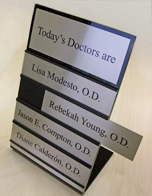
According to the US Bureau of Labor Statistics, 5.1 million hires and 4.9 million separations (quits, layoffs, etc.) occurred in the United States in the month of October, 2015—which is the most recent month in which stats were available. What this signals to economists is that the workforce is changing. What this signals to sign manufacturers is ‘oh no, obsolete name plate signs!’ Given the state of employment in America, a trend that we can expect in interior office signage is the need for replaceable name inserts on signs. Since turnover rates are increasingly high, name inserts that can be added and removed are a near necessity. Not only should office signage allow for interchangeable inserts, but directories in shared office spaces should also be replaceable. This way, companies save a boatload of money on buying whole new sign systems every time an employee moves out of their office, and sign companies are challenged to innovate new products that creatively allow for replaceable name inserts. Check out the example below of an interchangeable nameplate system.
#6: Curved Sign Systems
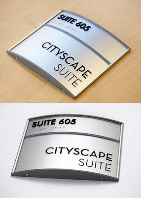
In baseball, there is no prettier sight than a hanging curveball that gets knocked out of the park. Well, in the world of signs, adding some curve in your sign system is bound to hit a home run, too. Not only should we anticipate the continuation of durasol (poster) inserts in curved systems, but we should also plan for the increased application of metal curved signs. With frames that are equipped for a natural, curved appearance, and materials such as durasol, acrylic, and aluminum that are durable enough to bend without breaking, it’s entirely plausible to think that someday the prevalence of curved sign systems will surpass that of non-curved signage. Not only do curved systems provide increased aesthetic value, but they also have functional benefits as text is visible from a wider range when these signs are mounted (shout out to my entry-level Physics class for that gem of knowledge). The Cityscape Suite signs below show a great example of a curved sign system to expect in 2016.
#5: Tactile on Frosted Acrylic
Let me preface this trend by saying this: everybody loves frosted anything. Whether it’s frosted vinyl (we’ll discuss in a minute) or frosted acrylic, the frost is certainly in. Ironically, I am looking out the frosted window pane in my office as I write this—it’s freezing here. Anyways, for a while we have offered frosted acrylic as an option on a handful of ADA Braille signs. Increasingly, customers are interested in the frosted acrylic piece with tactile lettering, but not just as an ADA Braille option. The tactile lettering adds dimension to a piece that is already sleek in appearance. Add some silver standoffs to mount these tactile, frosted signs to the wall and you have a real game-changing office sign. Because the text would be too hard to read if engraved, and vinyl lettering lacks dimension, tactile is the perfect way to incorporate text on a frosted acrylic sign. Check out the example below of a frosted acrylic restroom sign which incorporates black, tactile text. You can also purchase your own here.
#4: Going Frameless
The days of the framed-in signs may be over. Alright, that’s a bit dramatic. Although there is still a place for sign frames, 2016 may be the year that framed signs are passed up by flush mounts and slims. “Flush mounts,” for those who are unaware, are aluminum signs with a ¼” black acrylic backer to give signs added depth. “Slims,” are aluminum signs with a larger acrylic backer piece that is exposed on all four sides of the sign. Although the logic behind the move from framed-in signs to frameless signs is hard to articulate, the sales numbers don’t lie. Frameless signs are something big to expect in 2016, and customers should take a look at some of the popular options including flush mounts and slims for their workplace. See below for an example of a flush mount (top) and a slim (bottom).
#3: Signs You Wear
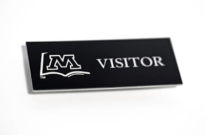
We live in a pretty mobile world. The days of “businesses on an island,” as I like to call it (where employees stay within their buildings and infrequently vacate the office throughout the day), are coming to an end. If your calendar looks anything like mine, there is hardly a day in which we don’t leave the office for a network event or a meeting or some other reason. Because of how mobile the modern day businessman or businesswoman is, it’s increasingly important for us to have signs that are mobile as well. Now, name badges and tags that display one’s name, company logo, and job title are seen nearly everywhere. Rather than a writeable “Hi, My Name is…” decal, companies are investing money in higher quality tags and badges for their employees. From heat pressed, aluminum badges to engraved acrylic tags, the wearable signs are the new fad. Check out an example of a stellar-looking, engraved name badge below.
#2: Window Vinyl as a Two-Way Tool
Ride up and down any street with commercial buildings and you’ll be hard-pressed to find doors or windows without vinyl graphics on them. From company logos to hours of operation, almost every company has taken the time to have window vinyl installed. What I’m trying to say is this: window vinyl is not a new concept. However, window vinyl being viewed as a two-way tool is a recent interpretation of a traditional sign medium. Let me explain. For many years, the sole purpose of vinyl material was to provide information; companies would display their phone number, website, logo, products they sell, etc. Now, vinyl materials are not only used to display images and information, but they are also used for privacy purposes. Thus, vinyl is a two-way tool: (1) providing information, and (2) providing privacy. This is most evidenced by two specific forms of vinyl—window perf and etched/frosted vinyl. Window perf is typically adhered to outer office windows and works to block sunlight as well as make it harder for a passerby to look inside the window. Etched, or frosted, vinyl is a matte material that obstructs the view of people looking in or out of a window. Window perf can incorporate printed designs, and etched vinyl can incorporate cut designs, making for some pretty stylish AND privacy-keeping products. These are bound to be a hit in 2016. The picture below perfectly demonstrates how window perf is a two-way tool; notice, the top half of the photo shows our view from inside the office (can clearly still look out window and see visitors coming) and the bottom half of the photo shows the view looking inside our window from the street (can only see the Chamber Choice design, cannot see inside the building). Neat, huh?
#1: Digital Signage
Ah, yes, how could I forget about the ever-popular digital signage? Of course, as almost every industry across the board is adjusting to the technological wave, the sign industry is also making room for the digital era. Digital signage displays are going to be a big feature in hotels, retail centers, hospitals, and beyond this year. The biggest advantage of digital signage is that it can be updated within a matter of seconds, versus a matter of weeks with traditional signs. Although the expenses associated with digital signage can be quite cumbersome, the agility and information sharing capabilities that they possess make them a huge asset for businesses. Working for a sign company that manufactures non-digital signage, I won’t even pretend to be an expert on the subject. I would suggest staying involved with the blog over at Digital Signage Today for updates. As a non-digital signage manufacturer, I can however say that the growth in the digital signage industry only challenges us to become more agile with our design and production of interior office signs. We are excited for what 2016 holds!
(image from Ezevue)
I hope you now feel more trendy. Shop for all of your interior signage this year by visiting Office Sign Company’s website. You can also follow us on our Facebook, Twitter, Google+, or Instagram pages to stay up-to-date with what other trends are taking place within the sign industry throughout the year!
Written by: Jack Yakowicz
Account Manager at Office Sign Company
Contact at jack@officesigncompany.com


