When I was in a small Minnesotan town a few weeks ago, we were walking through the quaint downtown looking for a place to eat. Cobblestone roads lined with oak trees created the perfect setting for a Saturday morning brunch. We came up on our first possible eatery – a café advertising fresh fruit smoothies, coffee, and breakfast. It all seemed perfect… until, we looked at the signage a little bit closer.
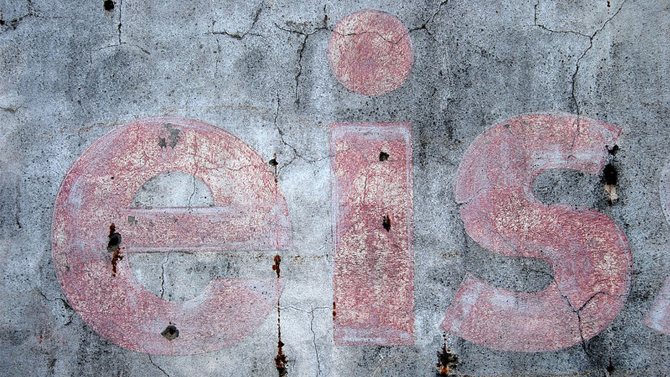
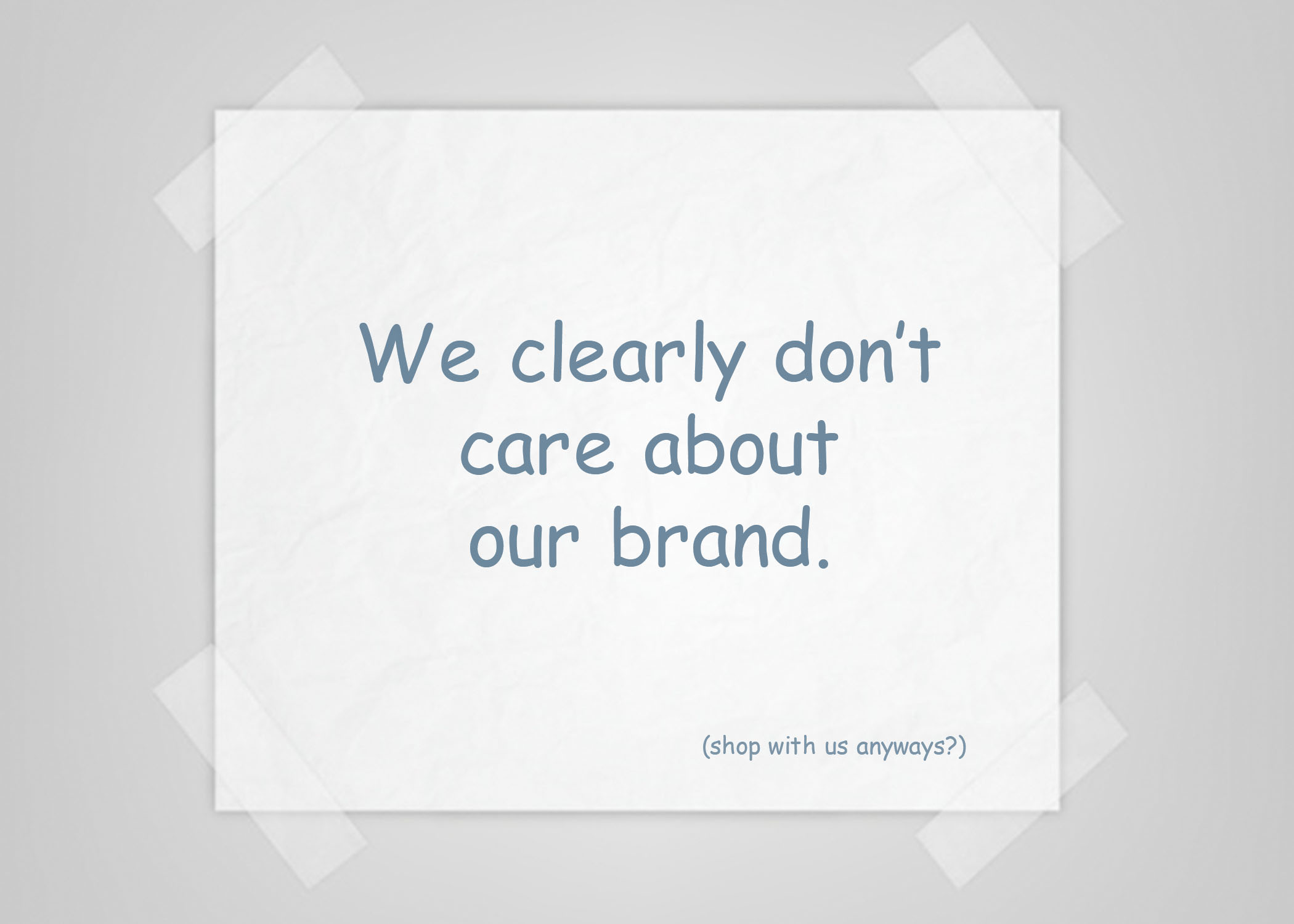
On the façade of the building was an aged wooden sign, with paint chips hanging on for dear life and the corners looking like they had been the feasting place of termites for years. The text “Café” was so faded it was starting to look like “Covfefe” and instead of decals on the windows, there was a taped up paper menu, with the font written in… comic sans. Needless to say, we kept walking up the block and found a different spot instead.
Now, am I being too much of a sign snob? I don’t think so. It’s not merely the fact that the signage was poor, but as a discerning consumer, my mind was automatically turned off to the way that this business chose to display its brand. No matter how good the smoothies were, the lack of care for the aesthetic of the restaurant automatically took away from the experience. Consumer marketing research suggests that I’m not the only one who believes poor signage can have damaging effects on one’s brand.
Poor Signage Makes Customers Less Likely to Visit Your Store

A FedEx-commissioned study through Ketchum Global Research and Analytics indicated that 52% of people are less likely to visit a store with a poorly constructed or grammatically incorrect sign. Not convincing enough a stat? Well the same study found that 68% of customers believe a store’s sign is a reliable indicator of the store’s excellence of product or service. That means that by simply investing in quality signage, your business is going to be looked upon favorably by at least 2 out of every 3 potential customers who pass your building. Still don’t believe me? The 2012 study also found that 76% of consumers have chosen to enter a store they had never before visited based purely on its signage. I rest my case.
Exterior Signage is Only Half the Battle

(pictured: an example of well-done interior signage at Prairie Roots Food Co-Op)
Alright, so you decided to invest in an exterior sign to get someone inside your business. Great! However, the work of your signs is not quite done. Despite how nice of a sign you have outside your business (which did get your customers inside the doors), you still need to follow up with great signs on the outside. Think of it like an attractive person with a really shallow personality; you don’t want to marry that person, despite how good-looking they are from the outside. People will marry your brand when you invest in quality interior signage.
Retail merchandising experts have found that consumer shopping experiences are largely triggered by in-store graphics, with more than 1 in 6 purchases being made when a brand display is present in the store. What does this prove? That investing in your in-store environment will have a positive return for your business. On the opposite end, poor (or non-existent) interior signage can negatively impact your sales. Industry professionals find that poor retail signage management (including the hanging of signs from varying lengths, misdirection due to poor placement, dated or dirty signage, etc.) can create a sense of chaos and disorientation that will ultimately drive the customer away from your store. Tough.
Coming Out of the Nightmare Signage Situation

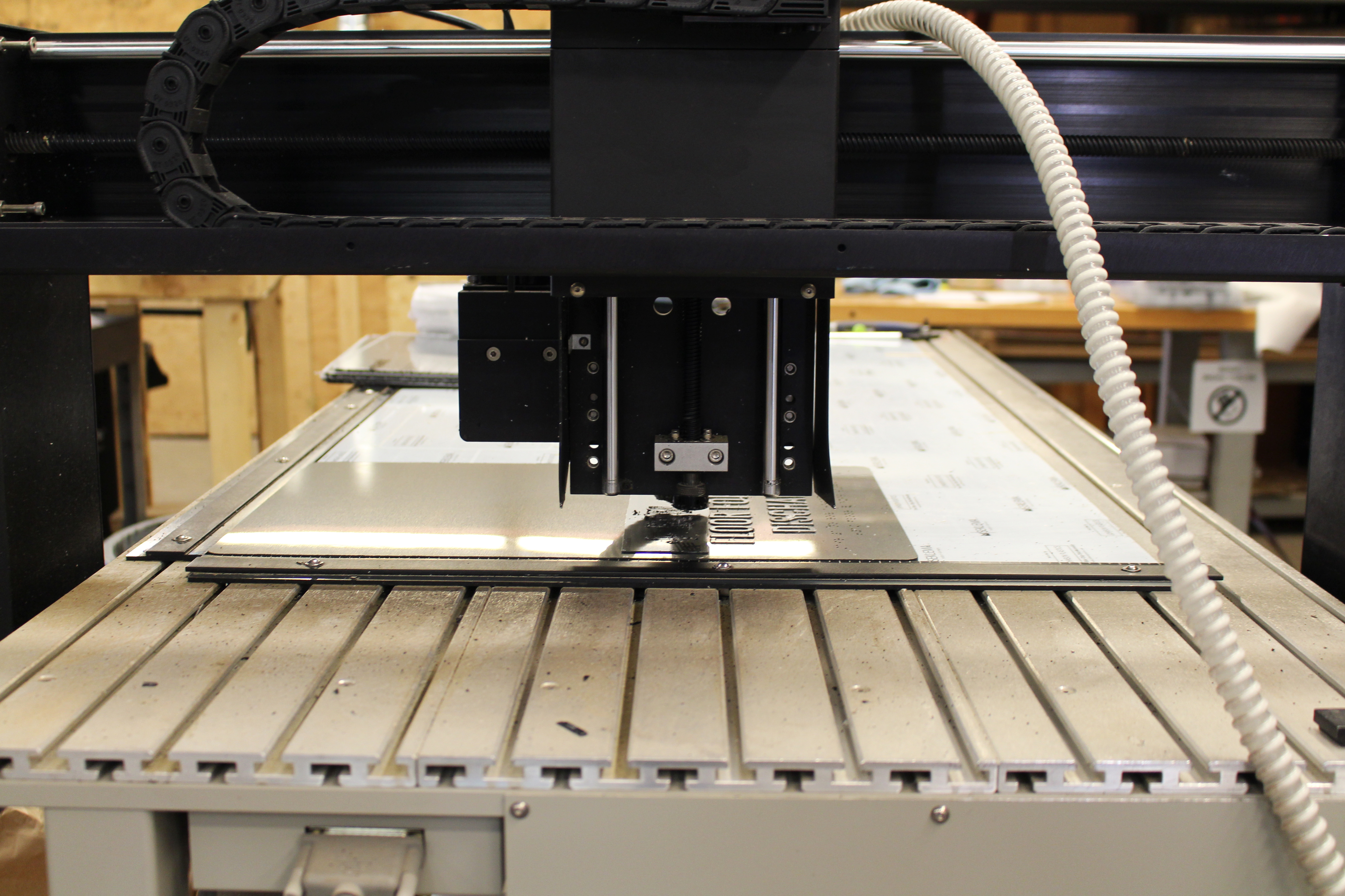
(pictured: some beautiful signage in the midst of being produced)
If your business has been dealing with some of the terrors of poor signage, fear not: there’s still hope! We’ve laid out a recovery plan that will help any struggling business regain a sense of control over their brand representation, and start enjoying the perks of better signage. The steps are as follows:
- Admit there’s a problem. Stop ignoring the grumblings of your customers (i.e. “I had no idea I was at the right place”, or “Are you guys still open?”). Admit that your signage needs a facelift in order to get more people in the doors, or convert more of your traffic into sales.
- Find some sign examples to emulate. Ask your family or friends what types of signs they have noticed around town – they’re bound to identify at least a few businesses’ signs that have caught their eye. Use this as a launching pad as you gameplan towards creating your own sign.
- Talk to a sign company. In order to turn your sign dreams into a reality, you need to go straight to the manufacturer for a proof & quote. Naturally, we’d love to be your go-to sign folks. Feel free to contact us at service@officesigncompany.com or by calling 701-526-3835 to begin!
- Make the investment. The most common question we get is “how expensive is a sign.” That’s a tougher question to answer than my calculus professors used to ask. With all of the ranges of materials, sizes, and more, it’s nearly impossible to give an accurate estimate unless we have more details. Exterior signage can range anywhere from $100-$100,000 (I know, right), depending on the type of sign you get. Regardless of budget, simply having a refresh on your façade and windows can do wonders, and you will find that the return on this investment is well worth it.
The silver lining, if you are one of these businesses that is struggling with poor signage, is that the damage to your company’s brand is not irreversible. Investing in new signage is a quick trigger to customers that your business is on the upswing, and will usher in a whole new regime of shoppers to your business. With any inquiries, including best tips, practices, and more, please feel free to give us a call at 701-526-3835 or visit our website for some valuable information on office signs for both your interior and exterior!
Happy Signing.
Written by: OSC Marketing Team
Contact at: marketing@officesigncompany.com


